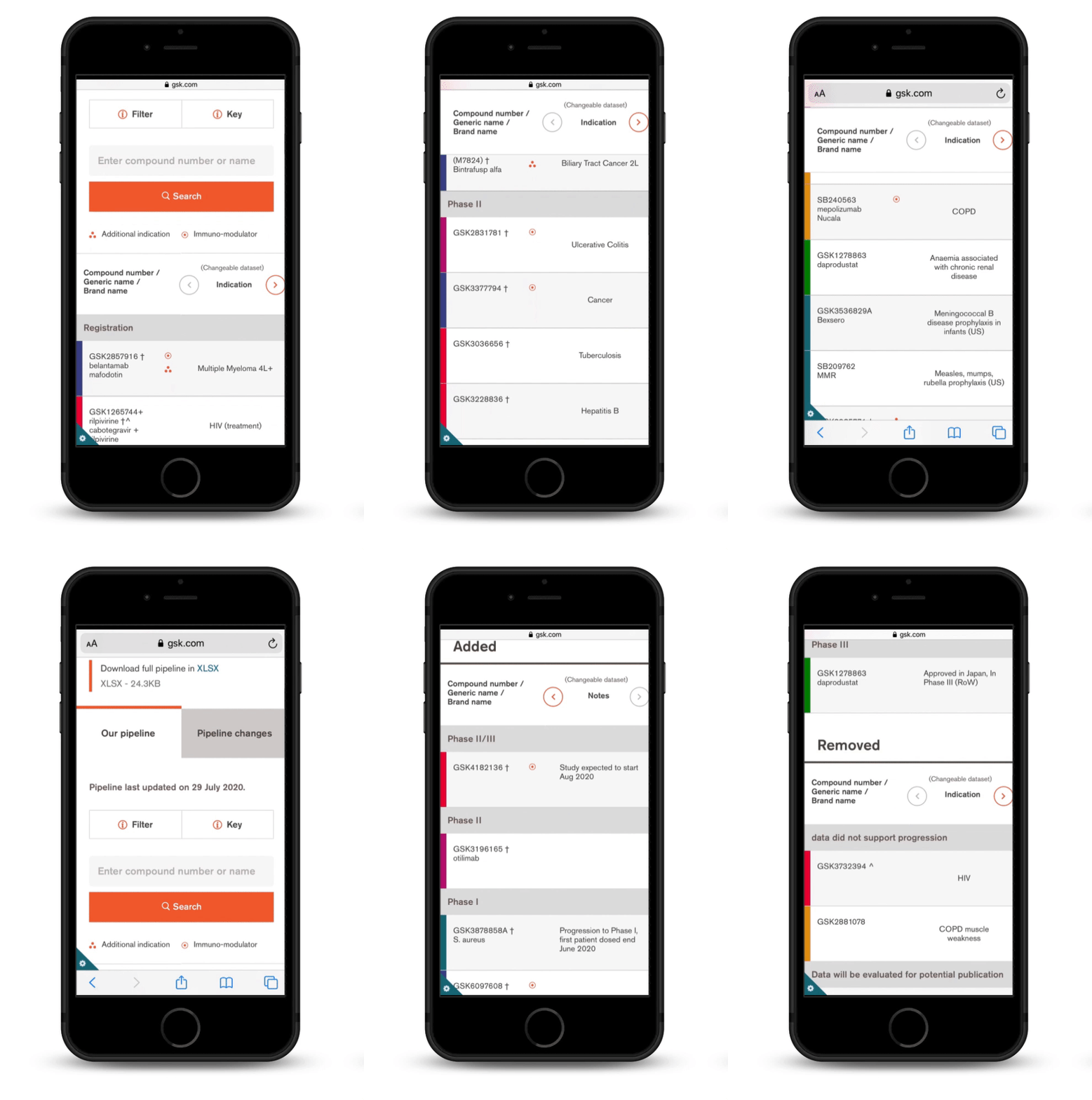
GSK product pipeline redesign
GSK tasked our agency to redesign its drug pipeline online, which is a key indicator of the future prospects of a pharmaceutical company.
One of the key challenges was to represent the data in a digestible way within the constraints of the existing UI. Another difficulty was aligning with multiple senior stakeholders who were not familiar with the UX process.
In the end, thanks to quick prototyping and testing, we delivered a streamlined experience on desktop, tablet and mobile.
Agency
Radley Yeldar for GSK
Results
Increased traffic. Decreased exit rate.
Role
UX strategist
Date
May - Sep 2019
Drug development is a long, expensive, and risky process. The pipeline is therefore a key indicator of the value and future prospects of a pharmaceutical company.
3 type of users
-

The Analyst (primary user)
(Investors & analysts, consultants, media)
“What’s the pipeline value?”
“Which pipeline assets were added?”
“Which compound(s) failed?” -

The Talent
(Researchers, Scientists, Academics, HCPs)
“Can I relate to GSK’s approach to medicine?”
“Is there anything I would be excited to work on?” -

The potential Beneficiary
(Patients, informed public)
“What progress is being made in the disease area specific to me?”
“Is there a future treatment soon available?”
“Assessing the risk and filtering out as early as possible compounds that might not eventually get approved is therefore essential.”
A drug pipeline shows a set of compounds that are drug candidates under Research or Development at any given point in time. The process of successfully launching a drug involves various phases that can broadly be grouped into 4 stages. It might take years before a compound gets to the market. Along this approval process, a few compounds will be discarded.
How does competitor’s drug pipeline look like?
I presented the competitor review findings in a feature comparison table to highlight some common patterns.
Redesign goals
See at a glance the latest changes
“The Analyst” is busy and needs to quickly know which compound has been added/progressed/removed.
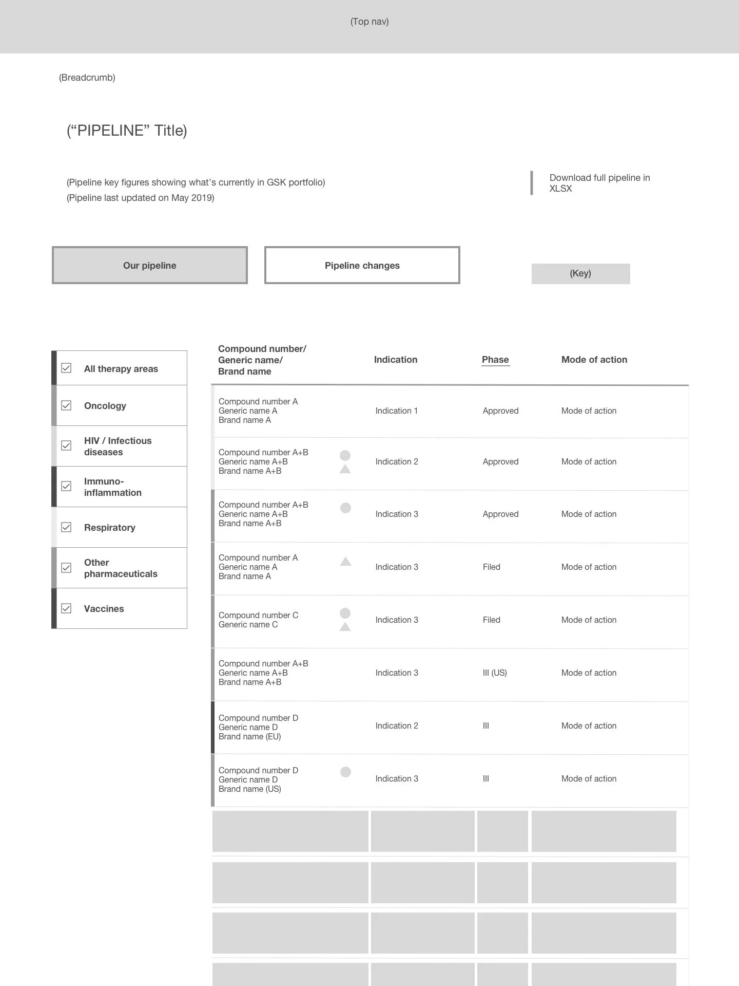
Filter by development phase
“The analyst“ needs to understand what stage of the R&D process the compound is currently at in order to evaluate its potential.
Avoid cognitive overload.
A pipeline could contain up to hundreds of assets. The content should be digestible on small-screen devices.
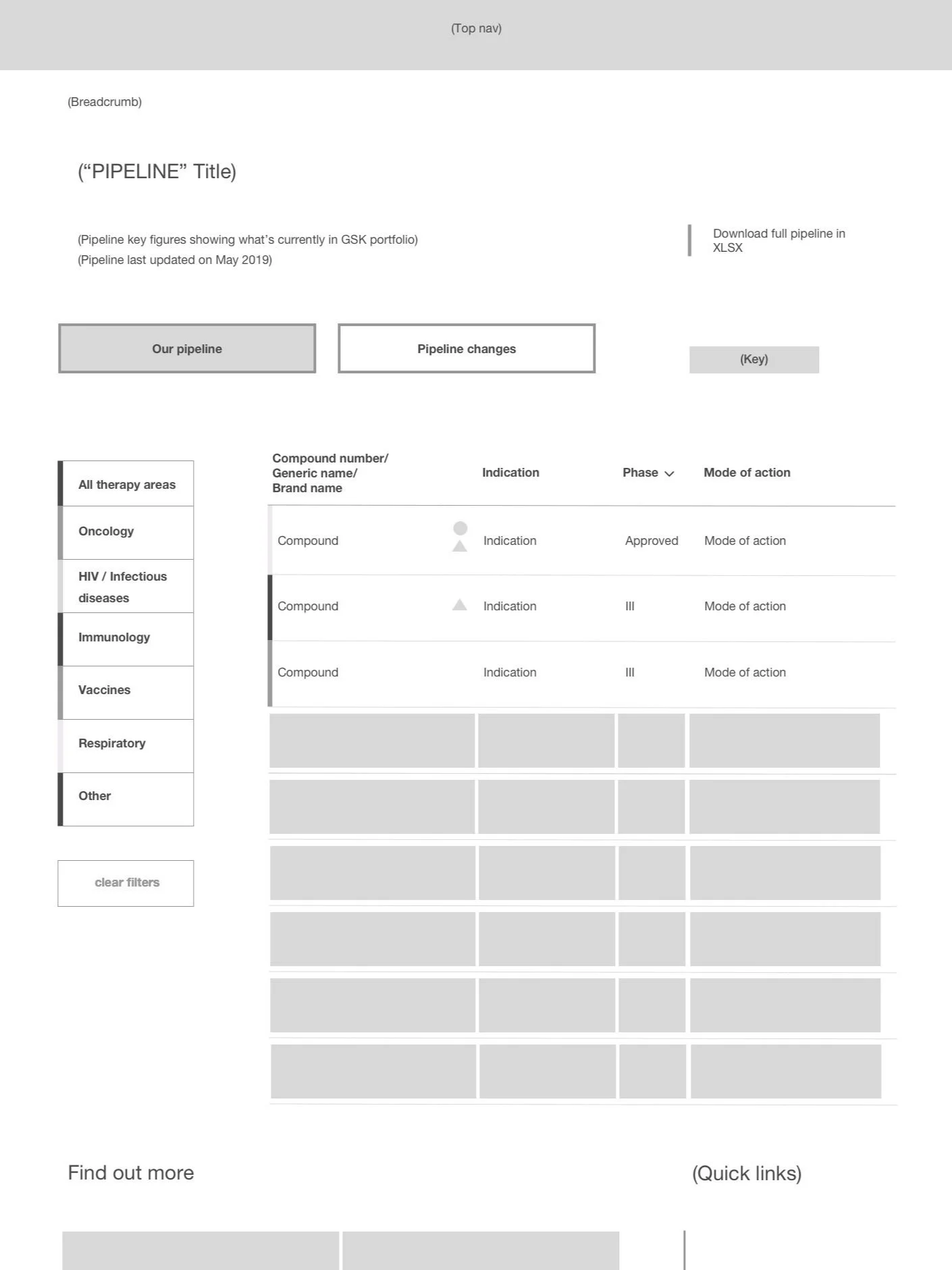
Filter content by therapy areas
It helps “the Analyst” evaluates the “potential market share” a drug would capture.
No dead-end experience
A fluid experience where users have the choice to dive into details or just glance.
As an analyst, I need to understand the compounds’ progress and potential application so that I could assess the value of the GSK pipeline.
How to provide an overview of the latest changes?
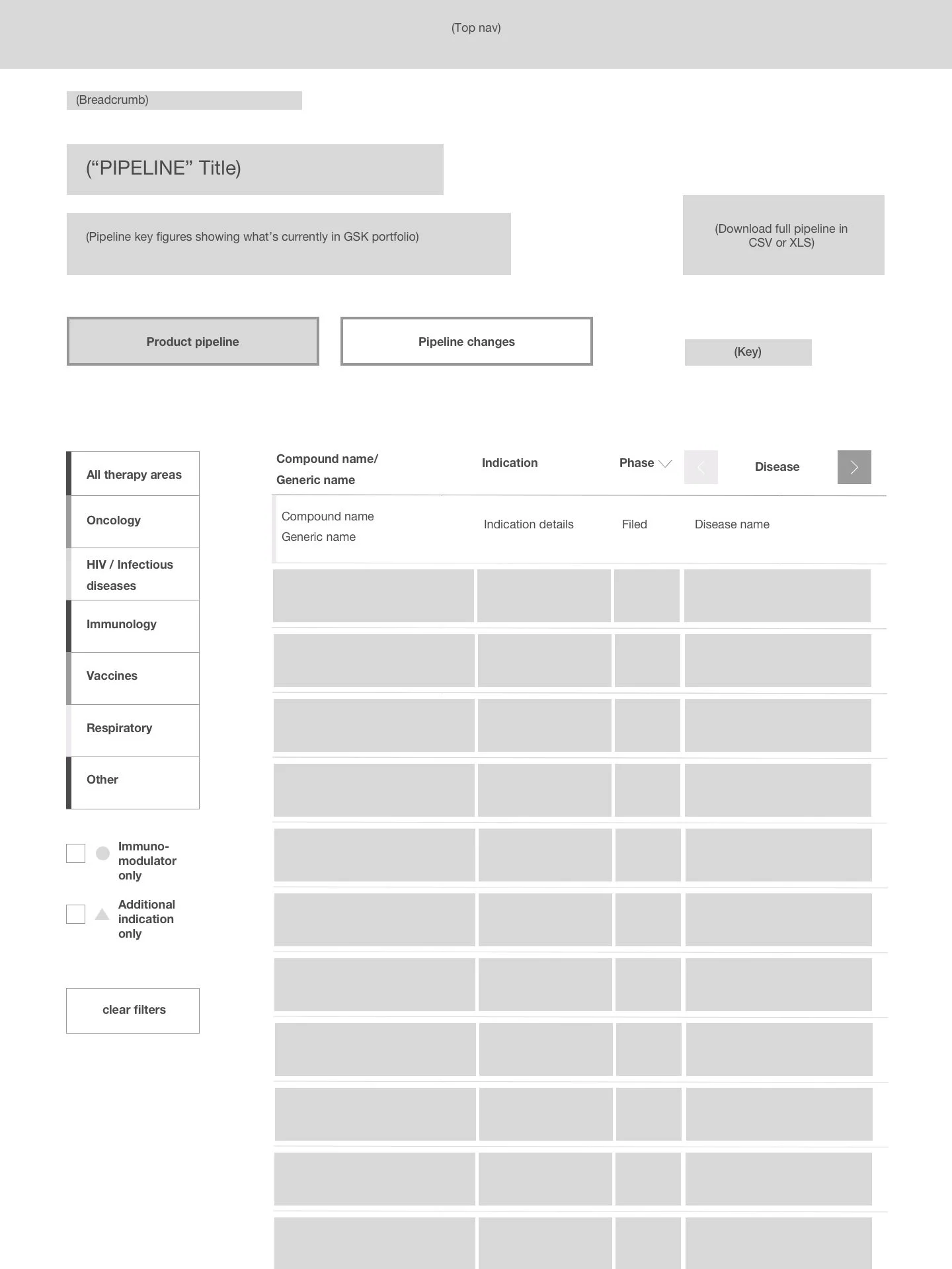
We split the information into 2 tabs:
“Product pipeline“ : full pipeline data
“pipeline changes” : a sum up of the latest compound updates (new, progressed, terminated)
I’m an analyst that follows GSK advancements in Oncology and Respiratory areas.
I'd like to see how many compounds are in the late stages of development to assess the risk and potential “market share“.
Scenario 1
Scenario 2
I’m a busy GSK investor on a long commute, I would like to check the latest changes in the GSK pipeline from my mobile.
Iterations
A compound could be associated with multiple indications. We tried in low fidelity to consolidate compound details into an overlay showing compound name (or number), associated indication(s), and progress history. Unfortunately, due to the way data was stored at the time, we were unable to implement this idea.
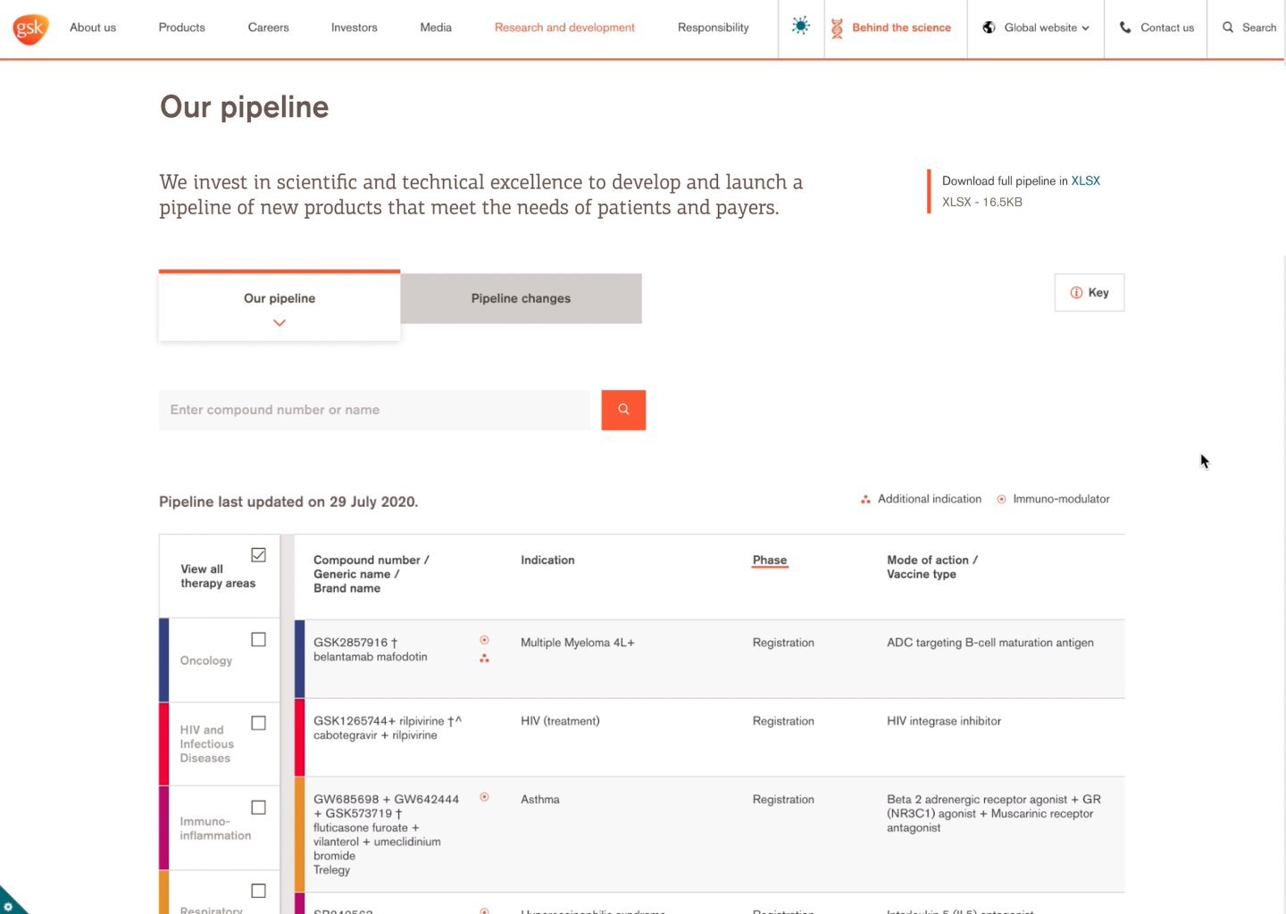
To overcome this issue, we introduced a search feature allowing users to search by compound code number or name.
A streamlined experience on all devices.
Thanks to close collaboration with the dev team and stakeholders, we successfully launched the new GSK pipeline: https://www.gsk.com/en-gb/innovation/pipeline.
One of the challenges of this project was managing stakeholders’ expectations. We were faced with many decision-makers from different backgrounds. Using prototypes and scenarios helped us explain our rationale and align on the redesign goals. Another challenge was the UI part, we were constrained to use the existing GSK component library.
Overall, it was really satisfying to see the client getting on board with the UX process and launching something with a big impact.
Key Takeaways
Credits
Creative Director: Damian Nowell
Account Manager: Sage Erskine
UI designer: Luke Wilkins


