OLIO App

Olio is a free mobile app with the mission to reduce waste by connecting people that want to donate food or household items. Olio wanted to attract new users and tasked us to redesign their onboarding experience in 10 days.
Through our research, we realized it was instead the landing screen and the item listing funnel that was confusing. As a result, we focused our energy more on the Add item listing experience to make it simple, fast and rewarding to post an item for the first time.
Client
OLIO via General Assembly
Results
Increased number of app downloads.
Role
UX designer
Date
May 2017
(10 days sprint)
After some initial traction, Olio wanted to get over a growth plateau and attract new users. They tasked us to redesign their onboarding experience assuming this was the main issue.
Discovery
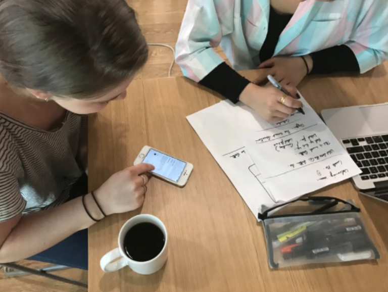
With limited research time, we needed to quickly understand the user needs and the business requirements, while taking into account the tech constraints. We selected 5 UX tools: user interviews, onboarding experience tests, surveys, competitor analysis, and a stakeholder interview.
The current Olio users’ interviews revealed some pain points and key insights about the context of use. The onboarding journey tests were particularly relevant as we realized this wasn’t the main issue keeping people away from the app.
-
Interviews of OLIO users
The conversations revealed the motivation and the pain points of current users.
-

Stakeholder interview
Interviewing Tessa, Olio co-founder, helped us learn from past design iteration failures, and align the company vision with our design goal
-
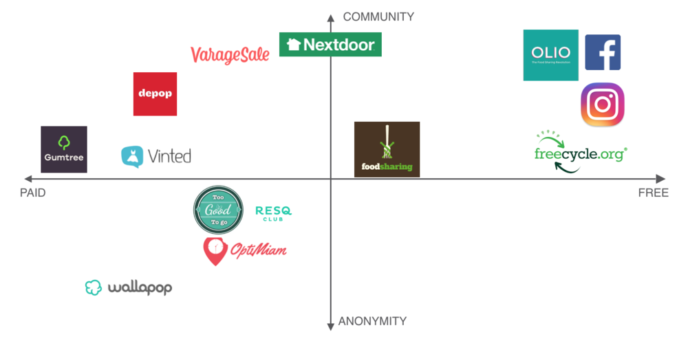
Competitor analysis
We mapped direct and indirect competitors to understand where Olio is positioned and identify some best practices.
-

UX Survey
We got 62 replies that helped us understand people’s attitudes and habits toward waste.
-

The onboarding testings quickly revealed there were too many food pictures and a lack of clarity in the brand mission.
-

However, we quickly realized our main issue wasn't the onboarding but the landing screen and the item listing instead.

Key research findings & insights
We used an Affinity Map to consolidate all the datas we collected. We then group them into logical groups until we see some patterns emerging. Here is what we found out after lots of post-it notes and coffees…
-

James, current user
22 years old, lives in London. He is a social guy and believes in the sharing economy.
-

Paul, new user
35 years old, recently moved to London. He would like to find an easy and fast way to get rid of some household items.
-

Anna, Olio hero
25 years old, lives in London. She is very engaged in social causes. She is an Olio volunteer, who picks up goods and redistributes them to her local community.
Ideation: How to make it fast and rewarding to post an item for Paul, a new user?
We presented the research findings to the stakeholders prior to the ideation. This helped us to agree to concentrate our brainstorming on the homepage and the item listing experience instead of the onboarding.
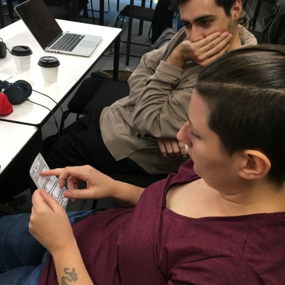
I led the ideation workshop with the stakeholders and us (7 people). We managed to gather lots of ideas and align on some features.
We ended the design studio with a feeling of aligned objectives. The takeaways were an idea of a dashboard-like page overview for the item listing screen. We also agreed on a date and time picker, multiple pick-up locations, and multiple pictures.

Scenario
Paul is eco-conscious but lives a busy life. He just moved to London and has no longer space for his office furniture and would like to give away some chairs.


Our insights got translated into potential features that we prioritized on a matrix based on feasibility and impact.
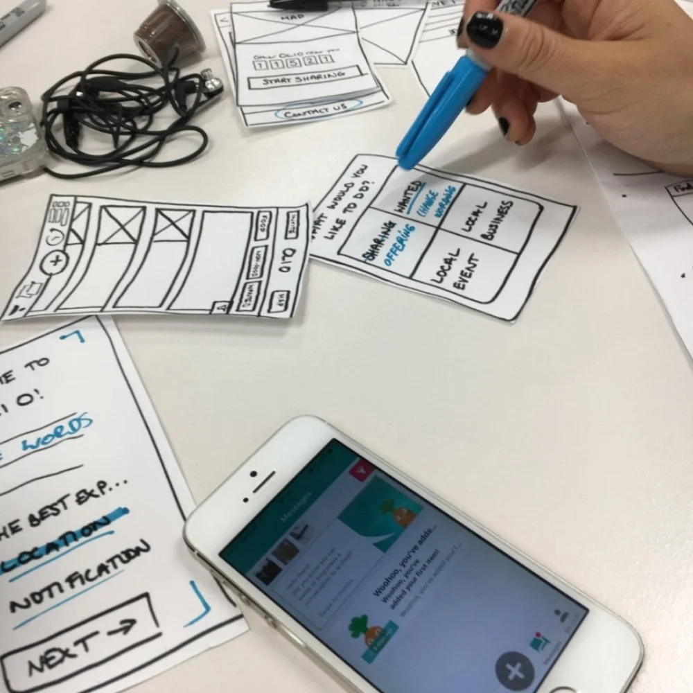
Develop, Test, Iterate.
To avoid confusion and overwhelming user with choices when posting an item, we break down the information. We needed several iterations to get it right.
Select a category first
We added a category selection screen with icons to guide users when they post a new listing.
Food / Non-food item
New users keep forgetting to choose between Food or Non-food, we solved this by using coloured buttons.

Set up multiple pick-up locations
During our research we realized people need at least 2 addresses for pick-up locations. Home and Workplace were the most common, so we added this feature and had great testing feedback.

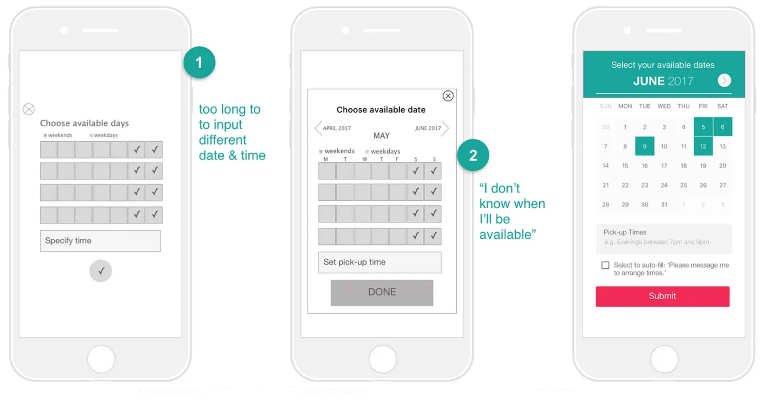
Calendar: set pick-up date(s) and times
We identified 2 habits :
Some users like to plan in advance: we gave them the possibility to select/ deselect available dates.
For people who need flexibility, we let them select the autofill message “please message me to arrange times“.
Little carrot tutorial
We decided to leverage the existing little carrot character and used it as a tooltip.

Onboarding wireflows
Add a new item wireflows

Key takeaways
I loved going through the research data and translating it into insights. The best part of this project was seeing our design being implemented and having a positive impact.
“Sleek! I like it, feels like it’s going to be easy to use. The little carrot is cute!”
— Sinead, Olio Volunteer“Wonderful thank you so much! Great working with you all.”
— Tessa Cook, OLIO co-founder